Understanding the Psychological Effects of Blue in Kitchens
The psychological effects of blue are profound, particularly in kitchen settings where mood and environment play significant roles. Studies in color psychology suggest that blue can induce calming effects, often fostering a sense of peace and relaxation. This is especially beneficial in high-traffic areas like kitchens, where stress levels can rise.
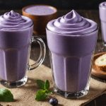
One intriguing aspect of blue’s effect is its role in appetite suppression. Research indicates that blue reduces hunger more effectively than other colors. This can help those aiming for portion control or seeking to reduce caloric intake. The soothing nature of blue may also contribute to a tranquil dining experience, encouraging mindful eating.
Also to see : Discover 10 delicious homemade low-calorie snacks to boost your weight loss journey
Integrating diverse blue shades can transform a kitchen into a serene haven. Light blues often add a sense of airiness, while deeper hues like navy or teal can make the space feel sophisticated. These shades do not only influence mood but also complement various decor styles, creating a harmonious environment conducive to both cooking and dining.
Understanding these effects can help you make informed decisions when designing your kitchen space, ensuring it not only looks appealing but also supports a healthy lifestyle.
Popular Blue Shades for Kitchen Designs
Considering blue color schemes can truly elevate your kitchen design, offering a range of styles that align with current color trends. Here’s a look at some popular shades:
Light Blue
Light blue embodies a soft, airy quality that suits kitchens aspiring for an open and inviting atmosphere. Ideal for cottage or coastal styles, light blue can enhance natural light and expand space perception. Pairing this shade with whites or pale greys creates a harmonious blend, further amplifying its freshness. Visual examples often highlight white cabinetry accented by light blue walls, reflecting serene seaside vibes.
Navy Blue
Navy blue brings sophistication and depth to kitchen designs. This shade can give your kitchen a luxurious feel, often used in more contemporary or traditional settings. For those seeking to implement navy, combining it with warm woods or metallic finishes like brass can add warmth and richness to the decor.
Turquoise and Teal
Turquoise and teal infuse energy and vibrancy, making them standout choices for a lively yet chic kitchen setting. These hues are excellent for injecting brightness and can be matched with playful accessories, like colourful cookware or bold artwork, to highlight their unique features. Integrating these shades through dishes or small appliances can add subtle splashes of colour without overpowering the space.
Incorporating Blue into Kitchen Decor
Integrating blue hues into your kitchen can be a rewarding endeavour, bringing both aesthetic appeal and functional benefits. When considering blue for your kitchen decor, think about how different shades can complement your current palette. Whether integrating blue through appliances, cabinetry, or backsplashes, the ultimate goal is to achieve a harmonious balance.
Begin by identifying areas where color integration can occur. For a subtle approach, introduce blue with appliances—such as a vibrant blue toaster or stovetop—that can serve as standout features. Cabinets can be painted in softer blue tones to maintain a neutral backdrop.
For more adventurous home styling, consider bold blue shades for your backsplash. Tiles can act as a canvas for intricate designs, adding character without overwhelming the space.
However, achieving balance is crucial when using bold blue hues. It’s essential to avoid overpowering a small space, potentially making it feel cramped or chaotic. Strategically pair blue with neutrals like whites and greys to maintain warmth and coherence. By following these tips, you can create an inviting kitchen that exudes tranquillity and style.
Expert Tips for Achieving a Balanced Blue Palette
Balancing a blue palette in kitchen design starts with understanding color balancing principles. Begin by selecting a dominant shade—perhaps a calming navy or a bright turquoise—and then accent it with complementary hues. The rule of thumb is to use the dominant color for about 60% of the space, secondary tones for 30%, and accent colors for the remaining 10%. This ensures a cohesive look and prevents overwhelming the senses.
Incorporate accent colors like whites, greys, or even muted yellows to enhance kitchen aesthetics. These tones can highlight blue’s calming influence while adding vibrancy. Materials like natural wood or metallics also pair well, providing warmth and depth.
Avoid common mistakes like overcommitting to a single shade, which can lead to a monotonous and flat appearance. Instead, apply different blue tones throughout to add dimension.
Finally, when considering design tips, remember that lighting plays a crucial role. Natural light can affect how blue appears throughout the day. Therefore, test your palette under various lighting conditions before finalizing decisions. This strategic approach will help you achieve a visually pleasing and emotionally satisfying kitchen environment.
Testimonials and Case Studies Linking Color to Weight Loss
Exploring the color impact on eating habits, particularly in kitchens, offers insightful perspectives on weight management. Numerous studies have found a correlation between color psychology and eating patterns. Blue, in particular, is often linked to appetite suppression, making it a unique inclusion for those looking to control consumption.
Real-life testimonials provide compelling evidence of individuals who have incorporated blue into their kitchens and noticed changes in their eating habits. One individual recounted how painting the dining area light blue created a calming effect, which reduced stress eating and helped mindfulness during meals. Another found that a navy blue backsplash served as a constant reminder to choose smaller portions.
Case studies back these experiences by analysing the psychological effects of blue shades, such as light and pastel blues, known for their calming influence. A small community experiment even illustrated how dining rooms painted various blues resulted in participants consuming fewer calories, compared to rooms in reds or yellows.
These findings collectively emphasize how strategic design choices in kitchen color schemes can support successful weight control journeys. By integrating blue, individuals may experience a more conscious and satisfying dining experience, aiding in achieving health goals.
Visual Inspirations for Blue Kitchens
To ignite your kitchen inspiration, exploring diverse styles through a curated gallery of blue kitchen designs can be transformative. These visual examples serve not only as a showcase of different aesthetic possibilities but also as a guide for applying various color applications effectively.
For those drawn to contemporary aesthetics, consider seamless cabinetry in deep navy, complemented by minimalistic silver fixtures. This combination exudes sophistication and luxury. In contrast, a rustic kitchen might incorporate light blue shiplap walls, which pair beautifully with antique brass hardware, creating a dreamy, vintage atmosphere.
The impact of these visuals on mood and behaviour is significant. A welcoming palette can encourage more sociable and relaxed dining experiences. Psychological studies suggest a pleasing color scheme can positively affect residents’ emotional states.
For hands-on individuals, experimenting with DIY projects provides an opportunity to weave blue hues into your kitchen decor creatively. Try painting an accent wall, or even rehabbing old chairs with a fresh coat of turquoise. Such projects allow for personalization, ensuring that the kitchen remains not only a functional space but also a reflection of individual style.
Final Tips for Blue Kitchen Implementation
Implementing a stylish blue kitchen requires strategic planning and thoughtful decisions. Begin by finalising your color choices. Testing paint colors under various lighting conditions ensures the blue appears consistent and appealing throughout the day. Natural light can dramatically alter a color’s appearance, so it’s crucial to observe how blue interacts with your kitchen’s existing lighting.
When moving to the design elements, consider design finalization steps such as coordinating cabinetry, countertops, and flooring that complement your chosen blue palette. Evaluating materials in person can help avoid mismatches and achieve harmony. Blue might pair well with materials like hardwood or marble, depending on the aesthetic goals.
For those embarking on a home improvement journey, sourcing high-quality decor and materials online provides convenience but requires careful selection. Look for reputable vendors, and read reviews to ensure you receive durable, appealing products.
These kitchen implementation tips not only aid in colour selection but also guide the procurement of finishes and decor. Implementing these insights invites a seamless transition into a rejuvenated kitchen space. Remember, creating a blue-themed kitchen isn’t just about aesthetics; it’s about enhancing mood, lifestyle, and everyday function.